Sapporo 2030 Olympics Branding
Design Brief
This project aimed to create a theoretical branding and merchandise language for the 2030 Winter Olympics to be held in Sapporo, Japan. Known for it's ice sculpture festival, local ski resorts, and it's famous beer, Sapporo is a place ideal for the Winter Olympics.
Sapporo was also host to the 1972 Winter Olympics, and is equipped with much of the infrastructure for hosting the Olympics again. I was tasked with creating a brand language and merchandising mockups which reflected a strong and recognizable image of not only the Olympics, but also the region.
Process
After doing background research on Sapporo and Japanese culture, I wanted my branding to follow the keywords ‘Modern, Wabisabi, and Pristine’. Wabisabi is a Japanese design philosophy that values the imperfections in life, which I thought was the perfect way to bring traditional cultural values into the modernity of the current Olympics. I also incorporated the Torii (shrine) gate as metaphor for Japan welcoming in visitors from around the world. The color palette was derived from wintry colors and those traditionally associated with Japan and Japanese kintsugi patterns.
These were the first iterations of the logo that I experimented with after sketch ideations. The design language of the pictograms was something I established through my sketches already, so I thought of incorporating them in the logo at first.
With more consideration and some peer feedback, I revised these early iterations of the logo so that the text was larger and the pictogram was removed in the final version.
Here are examples of what the pictograms for each sport would look like, along with the final color palette.
The headline and body copy fonts were chosen for ease of readability and to keep a modern feel. Sans serif fonts were key to making the branding feel current and not old.
Final Logo Design
Merchandising Mockups & Promotional Material
The merchandise and promotional material mockups were created to keep in line with the branding language I established above, reusing the design elements in key areas.

Merchandise Mockup: Notebook and Stationary

Event Mockup: Event Entry Wristbands

Promotional Mockup: Event Poster

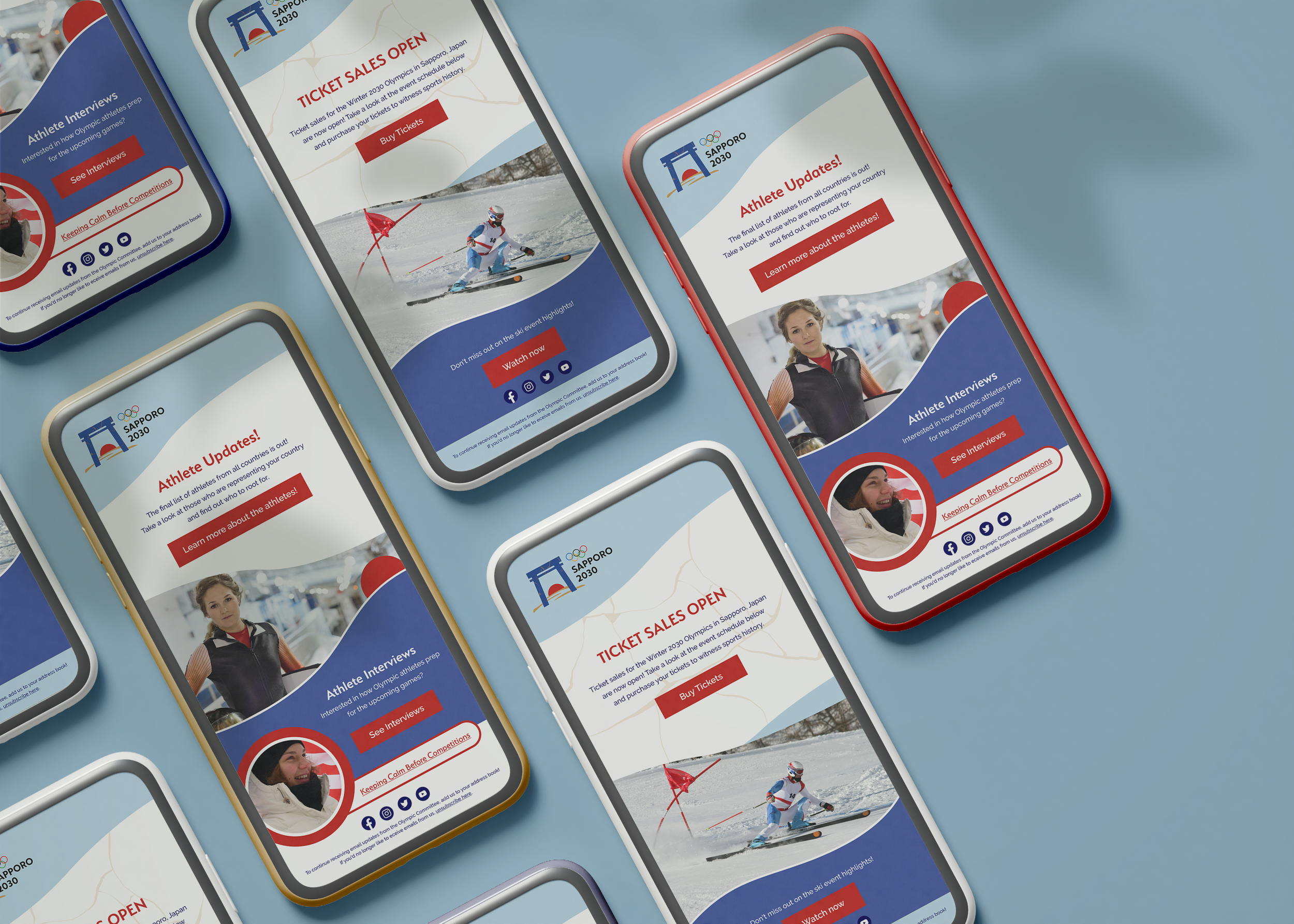
Promotional Mockup: Email Newsletter

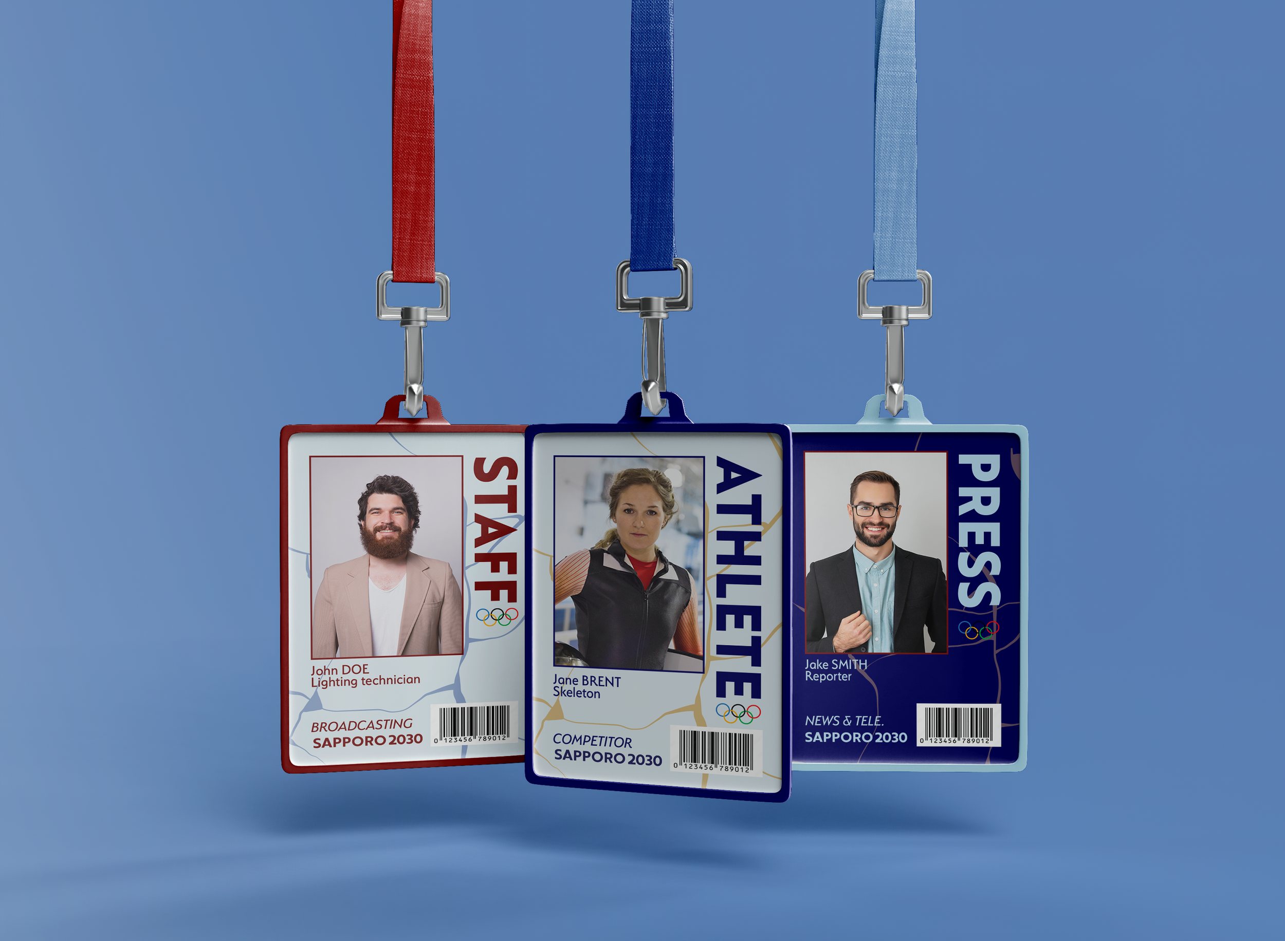
Event Mockup: Staff, Press, and Athlete ID Cards

Design Challenges, Notes, & Reflections
This project challenged me to create a branding language from scratch, with only the context of the Winter Olympics and the location (Sapporo, Japan). I was able to experiment a lot and get peer feedback on my initial ideations and creations, which helped me narrow down the final image of the branding that I envisioned. I struggled a lot in the beginning as I wasn’t used to designing for so many different aspects of the branding (merchandise, event promotion, etc.), but I think after completing all the parts of this project, I’ve got a much better idea of my design process.
There were many aspects of the brand that I created with a particular meaning in mind, but it’s amusing to know that not all of the designer’s intentions will be apparent to the audience. For example, the branching pattern I use throughout the design language is reminiscent of the Japanese practice of kintsugi*, which reinforces Wabisabi design values. Additionally, the three gold strokes below the main logomark serve two purposes. Firstly, to submerge the bottom half of the red sun, which references the way Japan is known as the land of the setting sun; secondly, they refer to the Olympic podium, with the highest stroke representing the 1st place podium, the next representing the 2nd place podium, and lowest stroke the 3rd place podium.
*Kintsugi is a practice in which broken pottery is mended or ‘repaired’ with gold lacquer to create a brand new and unique piece of pottery.

